Context Menu
tsx
tsx
A menu component anchored to an element. On web, the menu is triggered by a right click. On iOS & Android, it is triggered by a long press.
Platform behavior
- Web: Uses Radix UI's unstyled Context Menu component
- iOS & Android: Uses each platform's built-in native context menu component
Features
Zeego's menu includes Radix UI's features:
- Can be controlled or uncontrolled.
- Supports submenus with configurable reading direction.
- Supports items, labels, & groups of items.
- Supports checkable items (single or multiple) with an optional indeterminate state.
- Supports modal and non-modal modes.
- Customize the side, alignment, offsets, & collision handling.
- Optionally render a pointing arrow.
- Focus is fully managed.
- Full keyboard navigation.
- Typeahead support.
- Dismissing and layering behavior is highly customizable.
Plus other unique ones:
- Custom element preview on iOS
- SF Symbols on iOS with color customization
- Android system icons
- Images on menu items (remote images coming soon)
Installation
Make sure you've followed the getting started guide.
Usage
tsx
tsx
Web Usage
As of Zeego v2, any component available on Radix UI's ContextMenu is also available on Zeego's ContextMenu, and accepts the same props, when rendered on web.
Since Zeego is directly built on top of Radix UI for Web, you can not use StyleSheet.create objects on Zeego's style props.
Instead, to style items, you can do one of the following:
- Use inline
styleprop - Use
className, common for Tailwind users a. You can optionally use CSS file imports or CSS modules - Use the create function to create your own component and style it however you want
Component API
Root
Required component at the root of your menu.
| Prop | Required | Default | Platforms |
|---|---|---|---|
onOpenChange | web, ios | ||
onOpenWillChange | ios |
For more web props, see the Radix UI docs for ContextMenu.Root.
Content
Holds all of the content for your menu.
See the Radix UI docs for ContextMenu.Content to see usage for each prop.
| Prop | Required | Default | Platforms |
|---|---|---|---|
side | bottom | web | |
sideOffset | 0 | web | |
align | center | web | |
alignOffset | 0 | web | |
collisionPadding | 0 | web | |
avoidCollisions | true | web |
For more web props, see the Radix UI docs for ContextMenu.Content.
Trigger
Wraps the trigger for your menu. The content will be anchored to the trigger.
| Prop | Required | Default | Platforms |
|---|---|---|---|
style | web, ios, android | ||
action | longPress | ios, android | |
asChild | false | web, ios, android |
The action can be longPress or press.
For more web props, see the Radix UI docs for ContextMenu.Trigger.
Preview
Render a custom component when the context menu is visible on iOS.
Requires passing a function as a child.
The child element won't mount until the menu has been opened.
| Prop | Required | Default | Platforms |
|---|---|---|---|
style | ios | ||
size | ios | ||
onPress | ios | ||
isResizeAnimated | true | ios | |
borderRadius | ios | ||
backgroundColor | ios | ||
preferredCommitStyle | ios |
tsx
tsx
Item
Context menu item. Typically a row with text inside of it.
The key prop is required. The key must be unique within the entire menu, including submenus.
| Prop | Required | Default | Platforms |
|---|---|---|---|
key | Yes | web, ios, android | |
disabled | web, ios, android | ||
destructive | web, ios, android | ||
hidden | ios, android | ||
style | web | ||
onSelect | web, android, ios | ||
textValue | web | ||
onFocus | web | ||
onBlur | web |
On web, Item will render its a component as its child and apply styles. On other platforms, it simply renders a native menu item, and styles do not apply.
To render text inside of an item, use the ItemTitle.
tsx
tsx
For more web props, see the Radix UI docs for ContextMenu.Item.
ItemTitle
The style prop will optionally style text on web.
| Prop | Required | Default | Platforms |
|---|---|---|---|
style | web, | ||
children | Yes | web , ios, android |
ItemTitle either a string or React element as the child. A string is the most common usage. If you don't use a string, you must pass a textValue prop to the parent Item for it to work. It will error otherwise.
tsx
tsx
React element child
ItemTitle supports passing a text node as the child. However, you must pass a textValue prop to the parent Item for this to work. It will error otherwise.
tsx
tsx
The textValue prop will become the title on iOS and Android as the title. On Web, textValue will be used for typeahead, but it will not affect rendering.
ItemIcon
To render an icon on web, pass the icon component as a child.
For iOS and Android, use the ios prop and androidIconName prop.
On iOS, it renders an SF Symbol if you provide one.
On Android, it renders a Material Icon.
| Prop | Required | Default | Platforms |
|---|---|---|---|
ios | ios | ||
androidIconName | android | ||
children | web | ||
style | web | ||
className | web |
tsx
tsx
ItemImage
Renders an image inside of the item. Works on Web and iOS. On Android, it will be ignored.
| Prop | Required | Default | Platforms |
|---|---|---|---|
source | web, ios | ||
style | web | ||
resizeMode | web | ||
height | web | ||
width | web | ||
fadeDuration | 0 | web | |
accessibilityLabel | web |
tsx
tsx
Once it works, usage will work like so:
tsx
tsx
ItemImage with Expo Web / Metro Web
If you are using Solito, Vite, Next.js, or most web-only frameworks, then this does not apply to you.
However, as of Zeego v2, locally-imported images will not work as-is with Metro Web/Expo Web.
To fix this, you should create a custom ItemImage component which wraps Image from react-native:
tsx
tsx
ItemSubtitle
Receives children as a string. The style prop will optionally style text on web.
| Prop | Required | Default | Platforms |
|---|---|---|---|
style | web, | ||
className | web | ||
children | web , ios |
Android menu items do not currently support subtitles.
Group
Used to group multiple items.
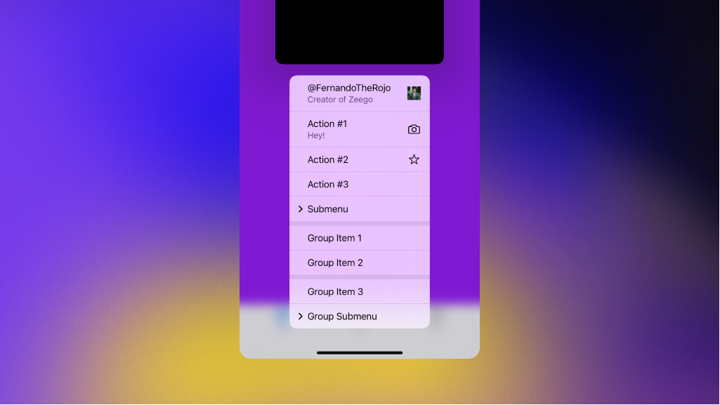
On iOS, items will visually group with a divider like Group Item 1 and Group Item 2 below:
On iOS, you can use the horizontal prop render items like so:
| Prop | Required | Default | Platforms |
|---|---|---|---|
children | web , ios, android | ||
horizontal | ios |
To add a title to the group, pass a Label component inside of it:
tsx
tsx
For more web props, see the Radix UI docs for ContextMenu.Group.
CheckboxItem
Usage is similar to Item with added checkbox features.
| Prop | Required | Default | Platforms |
|---|---|---|---|
key | Yes | web, ios, android | |
value | Yes | web, ios, android | |
disabled | web , ios, android | ||
destructive | web , ios, android | ||
onValueChange | web , ios, android | ||
hidden | web , ios, android | ||
textValue | web | ||
style | web | ||
onFocus | web | ||
onBlur | web |
tsx
tsx
You can also use a boolean for value, as of 1.3.0:
tsx
tsx
For more web props, see the Radix UI docs for ContextMenu.CheckboxItem.
There are a few subtle differences, such as onValueChange vs onCheckedChange, and the Zeego's result being "on" or "off" instead of true or false in the change callback.
ItemIndicator
Used inside of CheckboxItem, the ItemIndicator only renders when the item is checked. This lets you conditionally render a checkmark.
You should pass a checkmark icon as a child for web. On iOS and Android, the built-in checkmark will be used instead.
| Prop | Required | Default | Platforms |
|---|---|---|---|
style | web | ||
className | web | ||
children | web |
tsx
tsx
For more web props, see the Radix UI docs for ContextMenu.ItemIndicator.
Label
Renders a label. It won't be focusable using arrow keys.
On iOS & Android, only one label is supported (unless it is inside a submenu). It will be displayed at the top of the menu.
| Prop | Required | Default | Platforms |
|---|---|---|---|
style | web | ||
className | web | ||
children | Yes | web, ios, android |
tsx
tsx
Best used within a Group.
For more web props, see the Radix UI docs for ContextMenu.Label.
Arrow
Renders an arrow on web only. This helps point the content to the trigger. The Arrow must be rendered inside of Content.
By default, Radix renders the arrow as an <svg> element. You can customize the SVG arrow color by passing a fill prop, className, or style object with a fill property.
caution
Because the arrow is an <svg> element, its style prop is not React Native compatible. Styling it with React Native libraries may not work as expected. If you would like to render a custom styled <View>, use the asChild prop instead of wrapping this component.
| Prop | Required | Default | Platforms |
|---|---|---|---|
width | 10 | web | |
height | 5 | web | |
fill | web | ||
style | web | ||
className | web | ||
asChild | false | web |
See the Radix UI docs for ContextMenu.Arrow.
Separator
Renders a content separator on web only.
| Prop | Required | Default | Platforms |
|---|---|---|---|
style | web | ||
className | web |
See the Radix UI docs for ContextMenu.Separator.
Sub
tsx
tsx
Renders the parts of a submenu.
| Prop | Required | Default | Platforms |
|---|---|---|---|
onOpenChange | web | ||
children | web, ios, android |
See the Radix UI docs for ContextMenu.Sub.
SubContent
See the Radix UI docs for ContextMenu.SubContent to see usage for each prop.
| Prop | Required | Default | Platforms |
|---|---|---|---|
side | bottom | web | |
sideOffset | 0 | web | |
align | center | web | |
alignOffset | 0 | web | |
collisionPadding | 0 | web | |
avoidCollisions | true | web | |
children | web, ios, android |
For more web props, see the Radix UI docs for ContextMenu.SubContent.
SubTrigger
An item that opens a submenu. Must be rendered inside ContextMenu.Sub.
| Prop | Required | Default | Platforms |
|---|---|---|---|
key | Yes | web, ios, android | |
disabled | web , ios, android | ||
destructive | web , ios, android | ||
hidden | ios, android | ||
style | web | ||
onSelect | web | ||
textValue | web | ||
onFocus | web | ||
onBlur | web | ||
children | web, ios, android |
For more web props, see the Radix UI docs for ContextMenu.SubTrigger.